 |
| Only when you have painted your starter box, do you have my permission to die |
I'm about four test games into my Cybertronic starter box for Warzone, and I've hit a very unique dilemma with my painting: basically the fact that I can't decide what to do. I've got a handful of paint schemes ready to go, and proofed all of them to try to limit my options... and I've reached the point where I'm turning to the Interwebs for help in making up my mind.

Okay, so thus far I've thrown away over a dozen paint schemes, and tested more than half a dozen, trying to find the "perfect Cybertronic." I'm really running into problems here with my "favorite" changing just about every day, and I'm looking for some help on this one. Here's the biggest contenders I have right now. Please keep in mind all of these are maybe "80% completed" as they stand- more shading (especially in the skin) will be added, probably some battle damage, and camo patterns may be replaced by some really funky hexagonal camo stencils I have coming.
The Classic: Ahh, the nineties. Strange colors were badass, obviously shuolderpads were king, and the future was wide open and mysterious with a palate not seen since Barbarella. (If you don't know who that is... you need to brush up on your classic scifi.) This is my take on the "Classic Cybertronic" look- the highlighted Napoleon Blue, the bright yellow weaponry, the caution stripes for no apparent reason except it was the '90s and all the cool kids were doing it. Just enough metal in it to keep it interesting. I like the fact that it's the classic image... but don't see much point to it in the current rendition of the game. It sure doesn't scream "stealth" to me, and I'm not sure it fits the revised image of the MegaCorp.
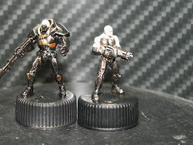
PowerChrome: The all-metal look screams strengths, speed, and brutal efficiency. Even with a bit of mixed metals in there, this one is going to look sleek and hot, and not be terribly long to paint up. The downside is, well... I am a bit of an elitist. First off, it looks a touch too much like some other gaming company's color scheme for their big robot army. Secondly... yes, these guys are six layered up, but from more than five feet it'll look like a "dip special" army, and I just can't have that on my conscience. (And before you ask, no I'm not interested in doing it in non-metallic metallic. It's a style I'm not really fond of.)
The Black and Gold: My buddy Frank felt the need to remind me that badasses wear Black & Gold. I'm certainly not going to argue that! This does give a very distinct look, and one not likely to be seen a lot of places. However... it's a major deviation of standard Cybertronic coloring without any solid reason for it, which I have to admit kinda irks me some. I'm sure I'd get over it with enough games played with an army of Sable & Or Cyborgs though.
Urban Camo: This was pretty much my original non-traditional paint scheme I was working on. It's a grey base with polydactic blue and white. Reminiscent enough of the original colors to have old school chops, and a fairly efficient urban camo pattern to boot. Not much of a downside here, except that it apparently didn't keep my interest since I went on to try a dozen other patterns!
Martian Camo: Nothing says Cybertronic like camouflage to me- their tactics of quick striking in small units fits well with a "special forces" motif, which to me is never a single color uniform. The major advantage to a Martian camo is that our principle "Warzone Resurrection Table" is going to be a Martian themed table, so these boys would fit right in. The downside is, well, I'm probably doing this exact color scheme for my Capitol force when I get around to them (because I will have at least a thousand point of every faction!), so it'd be a bit of redundant painting without reason.
Martian Night Camo Pattern: This one's kinda got a unique story to it. My girlfriend bought me an AND1 track suit for Christmas in a color pattern that she said "reminded her of a high-tech Martian camo pattern" for reasons you can clearly see in the picture below. I managed to capture most of those tones in this one, which I think would give a fairly unique appearance to the force as a whole. It certainly fits with Cybertronic's motif. The biggest problem is, well, that exact paint scheme is impossible to replicate by my skills, so I'm at best doing a "filled in version" and not the real McCoy.

So, that's pretty much my choices. I also did a "full grey" version like the new artwork (you can see him in the opening picture), but I decided it was just too simple of a color scheme and didn't pop enough for me. That's pretty much where I am right now. Any questions, comments, or suggestion you have would be very greatly appreciated, as I'd like to get my force a little more coordinated very soon.
 |
| Help him choose his colors, so he may have my permission to die. |
See you on the other side of the table,
The Second Class Elitist.


This comment has been removed by the author.
ReplyDeleteOr... Er... Martian Night cammo... or Urban cammo.
DeleteI like the Martian Night Camo the best.
ReplyDeleteMartian night or urban.
ReplyDeleteOr if you want really classic cybertronic keep the patterning of the martian night proof you've done but shift the palatte from black and red to dark blue and dark neon green.
ReplyDelete